
The Challenge
How do you create a jewelry brand that feels elevated without losing its personality?
Sunny Soul’s handcrafted pieces have a playful, individual character. The challenge was to translate that personality into a recognizable brand identity that would appeal to a young, style-conscious audience while still communicating the care and craftsmanship behind each piece.
I wanted the identity to feel fresh and coastal without relying on the typical visual language of beach-inspired brands.


The Process
I started by exploring how typography, color, and subtle graphic elements could capture Sunny Soul’s personality.
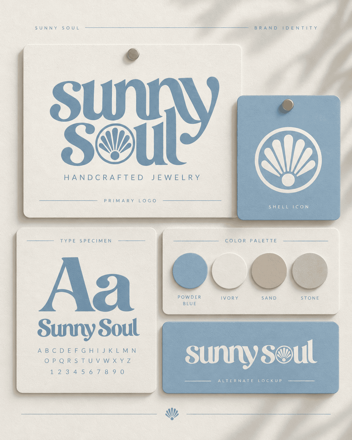
Typography with character. I developed an expressive serif wordmark with curved, flowing letterforms that balance a playful personality with a more refined aesthetic.
A connection to the coast. I incorporated a shell motif directly into the wordmark, creating a recognizable detail that ties the identity to the jewelry and its coastal inspiration.
A fresh color direction. I chose a soft powder-blue and ivory palette to move away from traditional gold-heavy jewelry branding. The result is light, inviting, and distinctive.
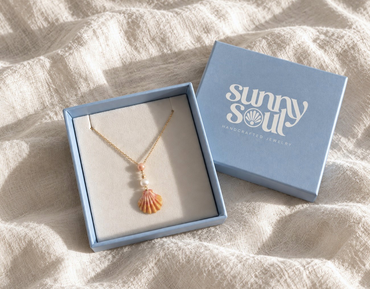
Bringing the identity to life. I explored how the visual system could extend across jewelry boxes, product tags, and lifestyle imagery, creating a consistent experience beyond the logo.



The Solution
A cohesive brand identity built around expressive typography, a distinctive shell emblem, and a soft coastal palette.
The resulting visual direction combines the personality of a small handmade jewelry brand with the polish of a contemporary consumer label. Packaging concepts, branded touchpoints, and lifestyle imagery demonstrate how the identity can translate across physical and digital experiences.
Outcome
Sunny Soul’s new visual identity direction establishes a recognizable foundation for the brand as it grows. The project demonstrates how thoughtful typography, color, and packaging can turn a small handcrafted product line into a cohesive and memorable consumer brand.