

The Challenge
Low-calorie products often rely on minimalist, health-focused branding that can make them seem less exciting than traditional alternatives. The goal was to create a sauce brand that led with flavor and personality, making the healthier option something consumers would be excited to reach for.

The Process
I began by developing a bold visual identity centered around a custom, sauce-inspired logo. I explored expressive typography, vibrant colors, and playful packaging that would make Dippy recognizable across different flavors and formats.
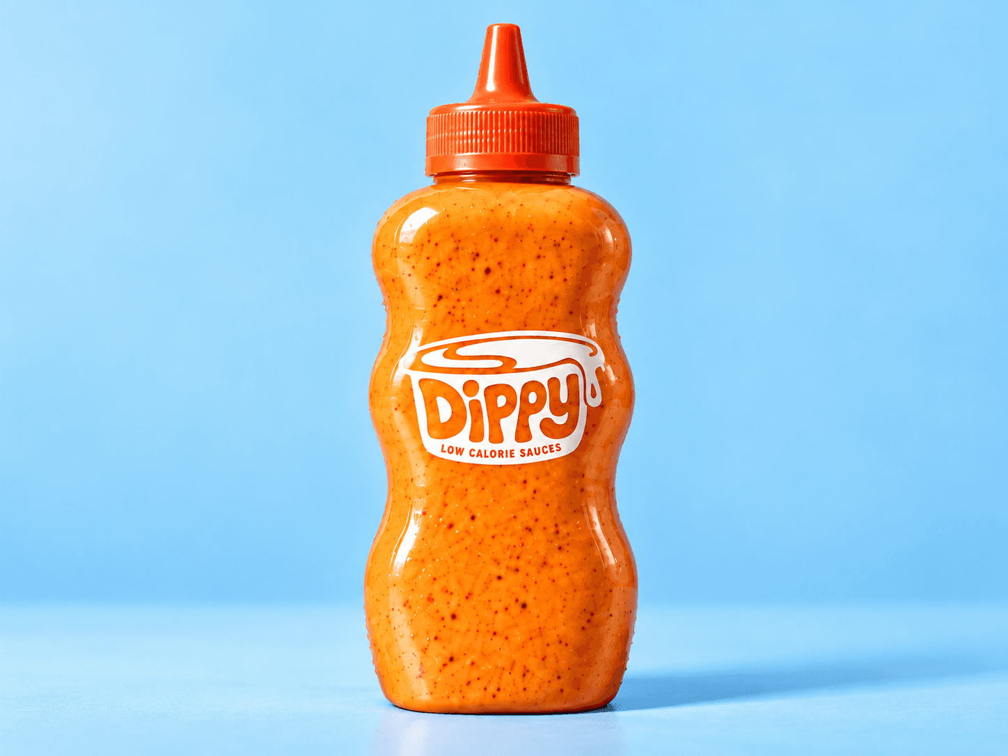
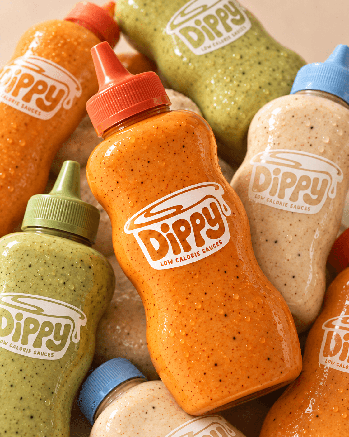
From there, I expanded the identity into a cohesive packaging system, using color and product photography to give each sauce its own personality while maintaining a consistent brand.


The Solution
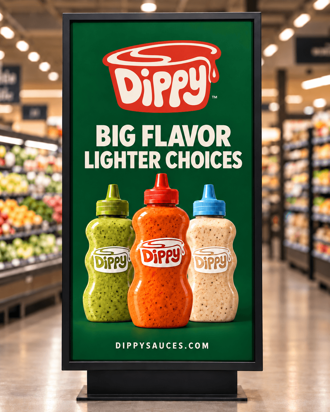
The final direction combines a distinctive dripping logo, colorful squeeze bottles, and bold, minimal packaging with the tagline “Big Flavor. Lighter Choices.”
I extended the identity into retail advertising, social campaign graphics, and a website concept, creating a flexible visual system that works across physical and digital touchpoints.
The Outcome
A cohesive brand identity and collection of launch-ready creative concepts that position Dippy as a fun, flavor-first alternative in the better-for-you condiment space. The project brings together brand strategy, packaging, and campaign design to show how a consistent creative direction can build a recognizable consumer brand.